Designing is neither an art nor a science - it is the struggle to find a balance between the two. Different designs call for more science (such as an AI chess game) while others are more artistic in nature (such as logo or a company or the design of a T-shirt). When trying to define rules for design, I think the only one that I find consistency in is that there are no rules. The only hope is to use some sort of framework to guide the design process along - and even that is a generous accord to the notion that there's method to the madness of design.
As far as the engineer in me is concerned, I am thrilled that I took NM4210. I won't go so far as to claim every concept presented in lectures was brand-new information to me, or it was something to which I was completely oblivious before, but the course seemed to gracefully tie up many loose ends for me, and give me a great systematic view on designing for experience.
The concept that will stick with me the most is just how crucial "experience" is to a product. This course completely obliterated any remaining thought in my head that a good design means the product serves its purpose well. It is much more than that. With rising competition comes rising benchmarks. A good product no longer suffices. Everything - everything - from the moment the user even hears about the product is being judged. So really, in order to be a successful product, the user must enjoy every aspect of it, not only the usability.
With that said, I have my own opinion of user experience design. With all due respect to any "framework" for design, or any "highly scientific" form of user research, the core of a good design is the designer. The creativity and imagination of the designer is what makes the product; the rest (framework, testing, evaluation, redesign) comprises 10% of it. There is a notion that innovation does not root from adding on feature after feature to something - you either have something innovative or you don't. It follows in the same light that you cannot force smart design. And let's not forget about luck. Sometimes you have to be lucky in design, or at least appreciate the fact that certain intangibles are unforeseeable, such as a person refusing to use a product - even if it is perfect in every way imaginable - to rebel against a certain group or cult.
The conclusion is that one must deeply understand the user. This does not mean spending thousands of dollars to create a living room that mimics his persona, or designing for every single user in the user population because it seems "safe." Understanding the user is a skill - a wisdom that can only be gained through experience. Once one understands the user, one empathizes with the user, and the task almost becomes designing for oneself, even if the product is a stroller for a grandmother. This point highlights the need for "by the book" things like user testing and evaluation, and don't get me wrong, I agree with them - but when it boils down to it, only the designer remains.
Wednesday, April 23, 2008
Assignment 4 - Final Project
Our final project was completed in a group of 4 students. Our decision was to develop a solution that would help young students understand financial responsibility.
From my personal experience, our project had two major cycles. The first cycle was attempting to pursue a credit/discount card solution. This idea revolved around students being encouraged to build credit early - a need that seemed to be lacking within the Singaporean sample students surveyed. This would have taught the importance of building credit as it pertains to financial independence, and also learning how to control spending and avoiding debt. The card offered a bonus of discounts at participating vendors. The feedback on this idea was that it would not be well received by the user population because credit cards have bad connotations associated with them. It also seemed to be too indirect in teaching financial responsibility.
The second cycle was the financial game, which eventually became the final design. This idea evolved through several phases of the design process.
Firstly, we as a group narrowed our identification of the need. From our user research, we concluded that the largest void that needed filling was fundamental knowledge of finance. The next step was to propose an initial product. Since our target users are young, we thought some sort of online game would be the most interesting solution.
The initial proposed design was linked to a major bank. The premise of the idea is to sell the parents instead of their children. As they walk into a bank, the parents see a poster; it tells them about a new program wherein they sign up their sons or daughters for a new bank account, and there is an online game they must pass to receive special rates, offers, and discounts. The game involves different topics, and as the young person completes each game, he or she receives an award. For example, when completing the "Debit Cards" game, they are given more free withdrawals every month, and so on.
Initially, the game involved the students reading a story, and answering challenging questions as they go on. We created a low-fidelity solution for this idea and user card-sorting and other personal forms of evaluation to test it. Feedback told us this game was too direct and stressful; it was too focused on knowledge examination that it became not very fun. Also, this is the phase where we received what I believe to be the more inspirational feedback that propelled us forward. We were so focused on teaching that we took it too far - we created a test-like atmosphere and caused information overload. We were told that learning takes several forms. Even a game like "Monopoly" taught many of us the basics of renting and owning land, but did so without us noticing it. Amidst the fun of the game, one can learn valuable long-term lessons. In retrospect, I cannot agree more with this. Hence, we decided to redesign the game and focus on making it fun, and trust that users will learn as time goes on.
We redesigned this game to create a high fidelity solution. We created a quiz show where each level is a different game (such as Jeopardy, Wheel of Fortune, Who Wants to be a Millionaire, and so on). Each level, coincidentally, was also a different topic. The users would be part of a network with their friends - those whose parents signed them up as well. Within this network, they could compete and interact with one another. Our goal was to have them learn information "in the back of their minds" by playing the games, but to really ensure they are having fun.
Using MS Access, we created a working solution of the "Jeopardy" game, and presented it. Our user feedback was generally good. The main area for improvement was to make the game more visually pleasing. Of course, creating the game in Access, we knew this going in. There were also a few minor functionality issues such as pop-up windows to define words and concepts, and so on. So the task became creating a final product - essentially a web site - that has all the aspects and features of the real-life final product.
We built a web-site that incorporated all the changes suggested, and did our best (with our humble art skills!) to create a "cool" aesthetic experience. We did final testing on this product to evaluate our prototype again. The constant testing and feedback proved very useful, as we saw a great jump in user evaluation. Many users actually seemed excited to play, and could really see themselves enjoying the series of games that we would create if we launched this program. In hindsight, the project was a solid success.
User Research Smoke & Mirrors - Reflection
The five-part article on "User Research Smoke & Mirrors" was an interesting and passionately written piece. The focus of the article was to dissect the usefulness of user research and to differentiate between science and design.
The author dramatically and long-windedly talks about how user research is oftentimes misused, misinterpreted, and even inaccurate. Although his repetitive, five-part article could have been shortened to one, I tend to agree with his opinions. He brings up fantastic examples that challenge the validity of high-tech, expensive forms of user research such as "eyetracking." He states that although eyetracking is a strong tool that can aid the design process, it can be detrimental if put in the wrong hands. For example, a lot of time spent looking at something doesn't necessarily mean it interesting or pretty - it could mean it is confusing. A misinformed designer could take a piece of information and draw a completely wrong conclusion, which leads to a completely wrong design. Basically, I believe a smart designer is more useful than any form of “by the book” user research such as eyetracking, since designing is not a science, but an art.
I also enjoyed how the author "grounded" the well-known IDEO piece. When I first saw that, I had an inclination that it was a highly idealized, edited version of how professionals design a product. And although it was inspirational, I prefer to see an accurate portrayal of how things really work, especially when I am young and somewhat impressionable.
I particularly agree with his criticism of the "persona room" idea. When it was first mentioned - before I read the details of it - I stopped and thought, "Wow, what an absurdly expensive and non-practical way to perform user research." As I read on, the author wrote his opinions exactly how I would have. I question whether the added value can even marginally justify the preposterous cost - a cost that can be avoided by, as the author puts it, "a smart UI designer." To me, this is a perfect example of "smoke and mirrors," a cool sounding idea that, when properly dissected, is unveiled as nothing but an overpriced, ineffective way to convince stakeholders or uneducated peers that a design is worth pursuing.
User research should certainly be included in the design process, but the pseudo-scientific methods should never be repackaged or modified to pass themselves off as purely objective or scientific. Doing so insults real user research, user research that is admittedly subjective and non-scientific, user research that admits it is only effective when observed by a professional, experienced designer. I definitely agree with the fact that there are numerous examples of blatant misrepresentation of data that draws inaccurate (or just wrong) conclusions.
The author takes several emotionally-written pages to arrive at it, and it seems rather obvious to me, but the conclusion merits repetition: user research is an important aspect of the design process, but when it comes down to it, smart designers with good ideas and experience are what make a good design.
Tuesday, April 22, 2008
Assignment 3 - User Experience in Lecture Theatres
The objective of this assignment was to analyze and understand students' learning experience in lecture theatres. The final goal was to break down user experience into fundamental aspects that could be redesigned to improve overall usability. As discussed in class, the methods used to acquire information were laddering and ethnography.
Ethnographic studies were done by interviewing users (in this case, current students), and extracting information about the real, physical experience of attending a lecture. Responses varied, but the consensus was that a few key issues were detrimental to the lecture learning experience. For example, there are rarely - if ever - enough outlets to allow students to plug in their laptops to aid learning in lectures. Furthermore, the physical environment bored the students; from the colour of the walls, to the repetitive use of slides, and even to the lack of interaction in lectures, students were not as motivated as they could be. Hence, their learning experience suffered.
Laddering analysis, on the other hand, allowed a concentrated look at the fundamental issues that lead to good or poor experiences in lecture theatres. These interviews were similar to ethnographic interviews, except that questions were continued until the root needs or wants were revealed. For example, when one student mentioned that sometimes he cannot see well in lecture halls, he was asked why that issue is important until it was revealed that "being happy in his career life" is important to him. Other laddering question revealed that students "want to be happy" and even "want their children to have a good life." The laddering analysis definitely helped us when thinking of redesigning lecture halls.
In conclusion, in depth user analysis was done to truly understand the underlying issues surrounding learning experience in lecture theatres. The key changes recommended are (among many) to allow more variable temperature control, design theatres to be circular so as not to have the back rows feel distant and uninvolved, make class sizes smaller to encourage interaction, to have more outlets to allow students to use lap tops more freely, and to change lighting to create a more visually pleasing learning environment.
Thursday, January 31, 2008
Assignment 2: Four Pleasure Analysis
Veronica
Veronica is a 39 year-old house wife living in Seattle, USA. She is married with no children, and her husband, Anthony – a very successful 52 year-old businessman – provides for the household; so she does not need to work, although she has an Arts degree from the University of Washington.
Due to her massive amount of free time, Veronica must find things to occupy herself with. She enjoys shopping for the latest modes and styles – she even has a personal shopper. She reads a lot of magazines to keep herself well versed in the fashion world. She almost feels like she is required to look and dress well because she accompanies Anthony to countless events and parties with other affluent members of society. Consequently, Veronica finds she is comparing herself with her peers – wives of Anthony’s co-workers and friends – who are often much younger than she.
Another hobby she has is cooking. Anthony works very hard and rarely ever has time to cook, so Veronica almost exclusively does the cooking in the relationship. Although the two go out to dinner frequently, they are occasionally forced to eat at home due to Anthony’s schedule.
She has friends and acquaintances with whom she eats out, attends beauty spas, shops, goes to the beach, and so on, but Veronica’s closest friend is her 35 year-old sister, Vivian. She talks to Vivian about all her personal matters, and they often shop together and give one another advice on everything from clothing to relationships.
Veronica is a very attractive for her age and stays very fit by working out, walking her dogs, and attending yoga and pillates classes. She has grown to care a great deal about her appearance. In fact, as a result of her social circle of younger women, her confidence is very low. She often attempts to boost her self-esteem by purchasing materialistic items (clothing, shoes, accessories, etc).
Her Four Pleasures
Physio
--She has a very mundane lifestyle since she does not work, so she frequently works out at the gym, walks her dogs, attends activity classes to pass the time (Need Pleasure)
--She must stay fit since she is often compared with other younger women in her husband’s social circle (Need Pleasure)
--She occupies herself with the spa, eating out, the beach, etc; but her main pastime is shopping (Appreciation Pleasure)
Socio
--Veronica buys sometimes very expensive items to show off to the other women in her social circle – it is very important that she is talked about (Need Pleasure)
--In addition to the other women, Veronica also tries very hard to ensure her husband finds her attractive, something she worries about as she ages. She also tries to maintain a healthy relationship with Anthony. (Need Pleasure)
--She doesn’t talk about it much, but Veronica wants her sister, Vivian, to look up to her because she is actually her best friend (Appreciation Pleasure)
Psycho
--Due to her free time and lack of particular expertise, Veronica takes great pleasure in conversing about fashion and design. She particularly enjoys it when she can talk to someone about facts she has read about in magazines. It boosts her self-esteem when she can teach someone – even if about fashion. (Appreciation Pleasure)
--Veronica really enjoys it when Anthony compliments her on her cooking. It is one of the only things in their relationship that Veronica can do better, so it means a lot to her when Anthony makes her feel needed in this sense – she gets a real sense of accomplishment (Appreciation Pleasure)
Ideo
--Veronica is incessantly trying to portray a glamorous appearance. Even if she does not feel that way at a certain time, she feels that she has to prove her elegance to her peers. She does this by wearing the latest fashions, including expensive jewellery, shoes, and accessories (Need Pleasure)
--She has never felt the urge to be a career woman; rather, she is content with just being a good wife and person. She persuades Anthony to give to charities on a regular basis, and this gives her a secret sense of satisfaction (Appreciation Pleasure)
--Despite her superficial attributes, Veronica maintains strong morals and principles in her marriage. Since childhood she has felt this quality is of the highest importance

We have a detailed description of Veronica as a being. The goal now is to provide specifications on a product – in this case a cell phone – that would be targeted for her. The following are the criteria for the design:
Her Phone
Appearance & Attributes
--Fashionable and attractive
-Brand identifier should be obvious and visible so others can clearly see it
Functionality
--Simple functionality – no complicated or unsightly technology (Bluetooth headset, GPS, etc)
--User-friendly interface (clearly labelled menu and options)
--Built-in camera so user can pass time taking pictures
--Adult puzzle-games (sudoku, scrabble, etc) to give sense of achievement
--Music player with head phones so user can work out with the phone
--Internet access so user can read about fashion, cooking, etc
Brand Image
--Professional and mature – so others look up to the user
--Brand associated with charities or environmental groups
--Expensive and difficult to attain
Sunday, January 27, 2008
Assignment 1: Products and Emotions
I've chosen to talk about shirts as my topic for Products and Emotions. Of course the most basic purpose of a shirt is to cover the body, but these days people wear shirts for peripheral reasons as well, such as comfort and style. Some people buy and wear shirts because they are attractive or beautiful - something that grabbed their attention and appealed to them at first sight. Others may choose to simply wear a shirt to school, the office, a social gathering, and so on; this category of users likely seek a reliable and durable shirt that serves its purpose and lasts a long time, even if it isn't the most outlandish shirt. Moreover, some choose to use shirts (and other clothing) to express their status in society or portray their self-image. For example, investment bankers or top executives often wear very expensive, well-made "banker shirts" to display an image to their clients. These three areas are defined as visceral, behavioural, and reflective users, respectively.
Visceral Shirt Design:

The above shirt grabs attention straight away. It is a bold, red shirt with loud, black beads decorating it. This type of shirt would likely be worn to a club, bar, rodeo, or somewhere in which lots of people are trying to get attention. It is more interesting looking than ordinary shirts, and it stands out as well. Such shirts range in cost anywhere around $10-50 USD on average, depending on the brand and material. I could see it appealing to impulse shoppers that want to satisfy their immediate needs and buy something that looks pretty. This type of shirt is often tight (to draw attention) and not particularly comfortable. Also, because of details like the black beads, they may only be hand washable or dry cleanable - major inconveniences. These negatives are a result of the "good looks."
Behavioural Shirt Design:

The above is an ordinary dress shirt. It can be worn in the office, at school, to a club, to any ceremony, and so on. Really, this type of shirt can be worn under nearly any circumstances (besides sports). It can do the job for years before it needs to be replaced. This type of shirt - similar to the visceral shirt - can be purchased for anywhere around $10-50 USD. Some are more expensive if tailored or are a particularly expensive brand, but the range is a reasonable average. These types of shirts are generally very comfortable and usable, and they can be washed regularly.
Reflective Shirt Design:

Visceral Shirt Design:
The above shirt grabs attention straight away. It is a bold, red shirt with loud, black beads decorating it. This type of shirt would likely be worn to a club, bar, rodeo, or somewhere in which lots of people are trying to get attention. It is more interesting looking than ordinary shirts, and it stands out as well. Such shirts range in cost anywhere around $10-50 USD on average, depending on the brand and material. I could see it appealing to impulse shoppers that want to satisfy their immediate needs and buy something that looks pretty. This type of shirt is often tight (to draw attention) and not particularly comfortable. Also, because of details like the black beads, they may only be hand washable or dry cleanable - major inconveniences. These negatives are a result of the "good looks."
Behavioural Shirt Design:
The above is an ordinary dress shirt. It can be worn in the office, at school, to a club, to any ceremony, and so on. Really, this type of shirt can be worn under nearly any circumstances (besides sports). It can do the job for years before it needs to be replaced. This type of shirt - similar to the visceral shirt - can be purchased for anywhere around $10-50 USD. Some are more expensive if tailored or are a particularly expensive brand, but the range is a reasonable average. These types of shirts are generally very comfortable and usable, and they can be washed regularly.
Reflective Shirt Design:
Monday, January 21, 2008
Assignment 0: Bad Design
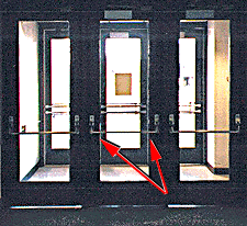
http://www.baddesigns.com/3doors.html
This door is an example of a bad design. The reason is that for the middle door (or any door for that matter) it is impossible to know for sure where to push to open the door. If you guess wrong - which has happened to me many, many times - you might as well be pushing a concrete wall. If a user deals with these doors frequently, he or she will likely learn to just push both sides at once to avoid confusion.
My overall reaction of this design is unimpressed. There are so many ways to create an obvious handle, such as having a plate on the side that is meant to be pushed, or having a horizontal bar that goes halfway across the doors, or even a sign on the correct side saying "PUSH HERE!" Frankly, I'm surprised that these handles are still being manufactured!
Subscribe to:
Posts (Atom)